This week, we are offering a free seminar on mastering Google Analytics for e-Commerce websites and businesses. While preparing for this seminar, I have conducted a very informal survey of e-commerce companies on our mailing list. My goal was to understand what pages they consider to be the most important to optimize. Here are the results for the top three pages:
- Product Page
- Shopping cart page/sequence of pages
- Homepage
One of the pages that I expected to see on the list was the product results page. It is important to not underestimate the power of this page. Have you considered how well your product results page is performing? Here are a few metrics to consider:
- Bounce Rate
- Exit Rate
- Correlation between the number of products listed and the number of purchases
Chances are that after looking at these metrics, you might consider optimizing your product results page to improve performance. To help you get started, here are 10 items to analyze and test:
1. Number of Products Shown
Recently, I was looking for a pair of pants. My search criteria are pretty basic – flat front, size 34, under $100. Here is the results page from Macy’s.
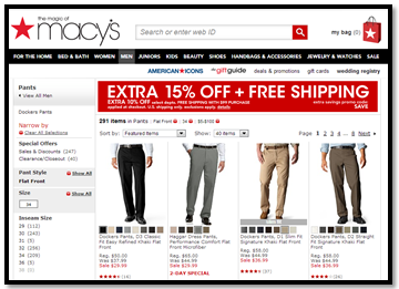
As you can see, I am presented with 8 pages of options. Is this overkill? My first reaction is to go to another site where I might have fewer options, hence it will be easier for me to make a decision. Testing the number of results shown on product pages to improve conversion rates can help you present website visitors with an optimal number of choices.
2. Product Discounts vs. Free Shipping
Ralph Lauren offers free shipping on purchases over $195. Additionally, a number of their products are heavily discounted, like the Hoodie below. The question here is – what will convert better a discounted product where you have to pay for shipping or a product at a regular price with the free shipping.
David Bell, Wharton marketing professor says: “For whatever reason, a free shipping offer that saves a customer $6.99 is more appealing to many than a discount that cuts the purchase price by $10.” Analyzing and testing various combinations of discounts might help you present consumers with an option they can’t resist.
 3. Promotional Banners
Here is another screenshot from Macy’s. As you can see, when I ended up on their list of products page, I was presented with a banner ad. Using Custom Variables in Google Analytics, we can compare the behavior of website visitors who click on the banner vs. those who do not. We can also test the performance and placement of such on-site promotion.

4. Use of Product Ratings
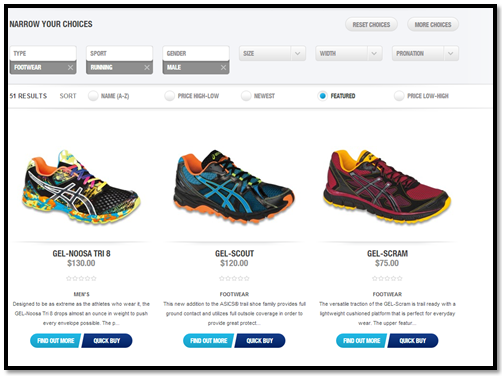
It seems that an ability to view product ratings will only improve user experience. However, a visitor might get distracted with trying to understand the system and accuracy behind these ratings – how many people were surveyed, how the ratings were calculated, who participated. Here is an example of how Asics product ratings are not adding any value.
I am looking for male running shoes. As you can see below, I am presented with options, and although the stars under the product are supposed to represent product rating, I quickly realize that these products do not have any ratings therefore these stars have no value.
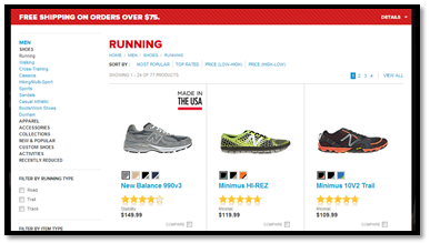
New Balance, on the other hand, does it much better. Here, I can see that different products have different ratings. The only information that should be present on your site is the one that adds value.
 5. One Page vs. Many Pages with Products
The majority of online retailers tend to show a certain number of products per page, and then you have to go to another page. Here is how Lacoste does it. As you can see, products that match my search query are displayed across 8 pages – 12 products per page, and I have an option to change this.

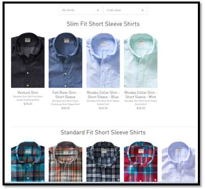
This is something worth testing. What is the optimal number of products to be shown on one page? Bonobos, another online retailer, opted for another strategy. No matter how many products match your search query, they are displayed on one page in the Pinterest like fashion. By using event tracking, you can identify at what page visitors stop exploring their options. (Here is a great blog post by Justin Cutroni on the subject). Personally, I am not going to look through 5 pages and wait for each page to load.
6. Optimize your Filtering Options
Most e-commerce websites offer filtering options. You can filter by brand, by style, by size, by color, etc. Here, the use of analytics is an absolute necessity to optimize your conversions. Leverage analytics to prioritize what options are important for consumers, and what options are not all that important. For example, when I search for jeans, I might care about filtering by size and by brand (not because I am cool this way, but because certain brands fit me better). However, I do not care and frankly do not know the difference between types of denim wash, and hence will never use this feature.
7. Adding a Call-to-Action
Analyzing and testing a call to action button is my personal favorite activity. Across all the websites that I have listed above, there is no explicit call to action on the product results page. Visitors know that the next step is to click on the product they like and to go to the product page.
T-Mobile, however, takes this experience one step further. As you can see below, every product has a button next to it that reads Add to Cart.
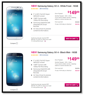
Obviously, a clothing retailer can’t do that, because a visitor needs to select the color of the product and the size first. However, adding a call to action that reads Customize or Select your Size might be worth testing.
8. Compare Products Feature
This feature is not as easy to test as others. This might require adding a new functionality to your site. However, if you are selling similar products and it is easy to overlook the differences in the specifications, this might be a necessary feature to help visitors make the selection.
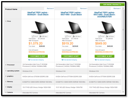
Yesterday, I was searching for a new Lenovo laptop. I have selected three laptops to compare from the options that have met my criteria and was presented with the comparison chart. There was one issue, the key differences were not highlighted, and I had to go line by line trying to understand what makes these laptops different. Perhaps it’s time to buy an Apple laptop.
9. ‘You Save’ vs ‘Percent Off’
Here is something interesting to test. Best Buy lists three prices for the product: Sale Price, Regular Price and You Save Price. Here is how they do it:
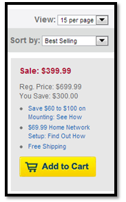
As you can see, they only use absolute numbers, and do not show you the Percentage off number. Nordstrom, on the other hand, employs a very different tactic. For each product that is on sale they list the following: Price Before, Price Now and the Percentage Off. Here is how they do it:
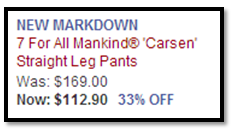
Both options work just fine in telling people that the products are on sale. However, it would be an interesting test to see if one option works better than the other one. Would you rather see the percentage or the actual amount you are saving?
10. The Proper Mix
There is no one feature that will make your product results page irresistible. In fact, most likely it is the right combination of products shown, discounts offered and page layout that will help you get your potential buyer to the next page. Ensuring that you have the proper analytical architecture is the first step to tracking the effect of these features on your conversions. There is no way to predict the impact analysis and optimization of these features will have on your conversion rate, but not doing anything will certainly not make it better.
Not sure where to start? Let us know, and we can take a look at your product pages together.


