A good email list is the foundation for email marketing. One of the key ways to creating an email list is getting your website visitors to sign-up for your company newsletter, updates and articles. Unfortunately, this is not as easy as it sounds. I see many companies put a newsletter sign-up box on their website but for some reason website visitors are still not signing-up.
How can organizations improve the newsletter sign-ups on their websites? Let me help by offering 10 easy tips that can help you increase conversion – # of sign-ups/ # of visitors.
1. Your newsletter sign-up form needs to have a value proposition. Too often, I see a newsletter sign-up box that doesn’t even tell me what I am signing up for. Here is an example:
Add a brief description to the offer, just to help your website visitors understand why they should join your mailing list. Here is an example: FREE subscription to a weekly newsletter with marketing research, case studies, web clinics and news digests.
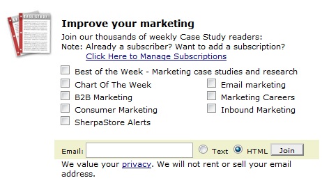
2. Segment from the start. Offering several subscription options to your visitors can serve a dual purpose. On one hand, you are immediately segmenting your list; on the other hand you are telling your visitors that the newsletter is tailored to their interests. Here is how MarketingSherpa does it:
Do not offer your website visitors too many options. At the end of the day, you will have to produce all the different pieces of content that you promised.
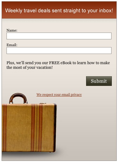
3. Incentive goes a long way. Your newsletter is an offer, but what about an incentive? Think about giving people something of value if they sign-up. For example, sign-up for our newsletter, and we will send you a copy of our latest FREE eBook on <topic your audience is interested in>. Make sure that your incentive offers real value to the people who you want on your email list. I probably will sign-up for your newsletter if there is a chance to win a Starbucks Gift Card, but I will unsubscribe soon after. Here is an example of an incentive:
4. Address privacy issues. Last thing we all want is to get spammed. Tell people that you respect their privacy, and will protect their email and contact information. A short statement about your privacy practices can put your visitors’ minds at ease. Here is an example: We never sell or share your information.
5. Begin with an email box. When asking people for their contact information, begin with an email box. You do not need any more information, and when people list their email address they tend to be more committed than when they simply list their name. You might want to consider asking for an email (required), and then asking for person’s name (optional).
6. Do I really have to SUBMIT? Submit is not the most effective call to action. It is ambiguous to say the least. Try something more specific. Your call to action button should tell me what exactly I am getting myself into. Here is an example:
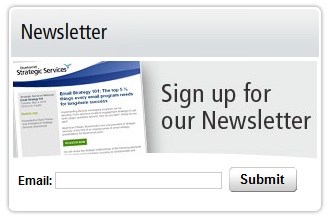
7. Consider using an image in your newsletter sign-up box. This might give people a preview of what they will be receiving from you soon. The image, however, should not be ambiguous but rather tell a story and support your offer.
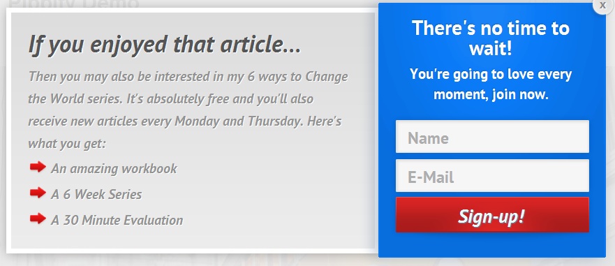
8. Experiment with a newsletter sign-up pop-up box. This might work well on your blog. The reason I say experiment is because this doesn’t work for every site. However, it might be worth trying. I am inclined to sign-up for a newsletter when I am reading a blog and see that the company offers real value. Here is an example of the newsletter sign-up pop-up box:
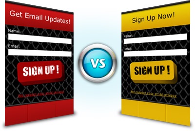
9. Split test your newsletter sign-up form. The only way to surely increase the newsletter sign-up is to test your form and a call to action. Sometimes the color of the button, the call to action or the size of the form makes all the difference. Here is an example:
10. Leverage social proof. Consider including how many Facebook fans your company has as a way to prove the value your company offers. Another option is to add a quick testimonial to the newsletter form to give people a glimpse of what makes your newsletter special.
Summary
At the end of the day, do not try all of these tactics at once. Use your website analytics to test which options work better, and continuously optimize your newsletter sign-up form. Remember; never take the attention of your website visitors for granted. You have to work hard on getting people to join your mailing list.


