If you use Google Analytics as much as we do at InfoTrust, you most likely have noticed that the interface has recently went through some changes. Specifically, this month Google has started to roll out changes to the navigation in the UI that has a slight impact on how you access all the reports.
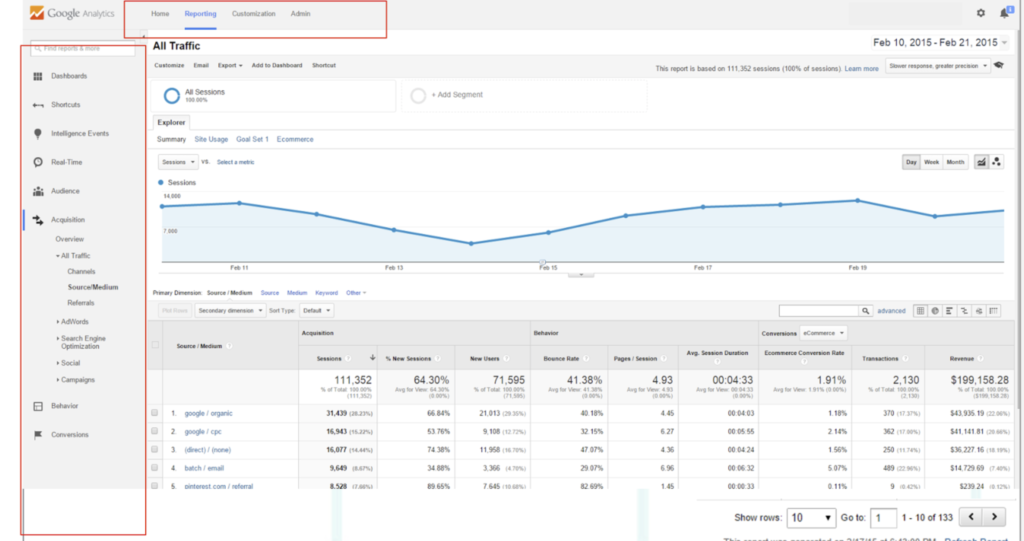
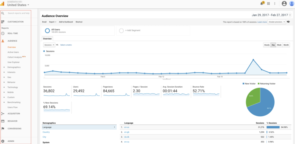
Before I begin to list out these changes – Here’s a breakdown of what the interface looked like before and after.
Old Google Analytics Navigation:

New Google Analytics Navigation:

Did you see the difference? Honestly, you might miss this change unless you are constantly using Analytics on a daily basis. For those of you who are, you might be a bit frustrated as it takes a little getting used to.
Here’s a breakdown of the changes thus far:
- All navigation is now located on the left side bar. The old configuration used to have menu items (Home, Reporting, Custom, Admin) located on the header.
- Dashboards, Custom Reports, Shortcuts, and Custom Alerts are all located under the Customization Section.
- Admin Section navigation is now located at the bottom of the left hand nav.
Finally, searching for a specific Property and view is now located at the top left side of the screen with it’s own independent navigation (screenshot below). This is pretty clutch when you need to quickly navigate to a separate account and is a heck of a lot better than loading a new page.

In summary, the although small changes, these little tweaks that Google has made has definitely made navigation more efficient. If you haven’t been used Analytics lately, it might be worth checking out the changes and seeing for yourself. 🙂

