
Building an effective dashboard is tough work. I find most clients struggle when trying to build a dashboard internally due to a lack of agreement around what should go into it. Sure, there are also technical challenges, but I can’t count the number of times I’ve been told in my career to build a dashboard for an entire business unit (or even company) with little to no guidance from the stakeholders. Usually, either I as an analyst should “just know” what reports they normally look at or, more likely, nobody has the time to stop and provide input.
Unfortunately there’s no real way around this, and often times stakeholders have strong opinions about what should be included months after the dashboard is complete. However, with that in mind, I still find it helpful to document the why behind what I’m building.
If you’re struggling with input from stakeholders, create your own version of a framework below and share it back with them. Ideally you can get an idea if what you’re covering in a dashboard is what they actually want to see or answers their immediate business questions.
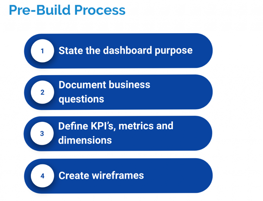
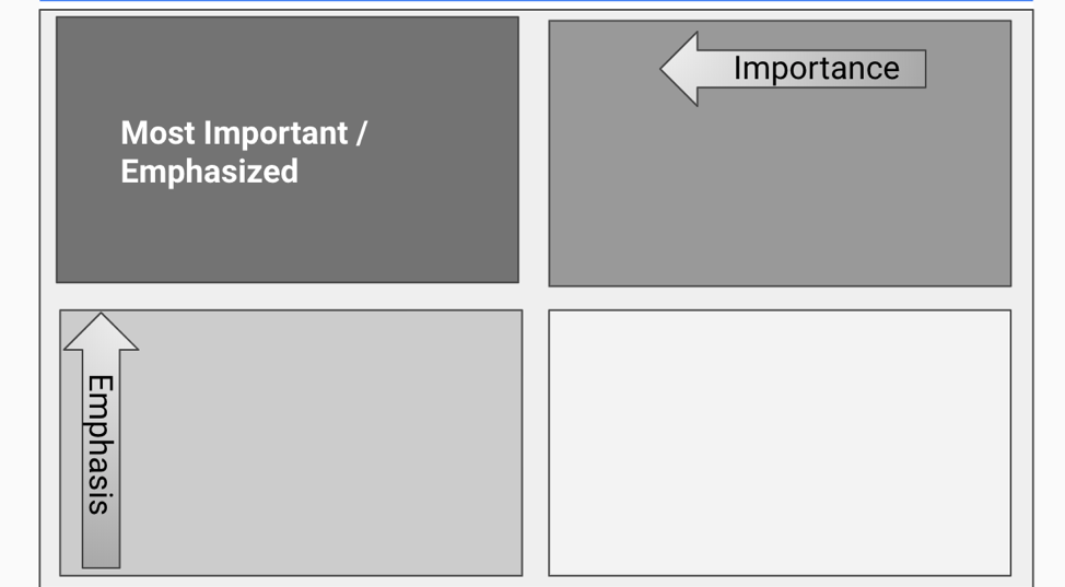
When you’re creating your wireframes or actually going through building the dashboard there are a couple of things you can do to help ensure your success. First prioritize what you’re putting in your dashboard. I like to divide my dashboard real estate into four quadrants, understanding that most people read a dashboard in a Z pattering starting in the top leftmost corner.
Next be deliberate in your pre-attentive attributes; these are the visual elements of a dashboard that the subconscious mind picks-up on before starting to think about the numbers. It’s the short mental homework that we don’t even think about that draws our attention to what’s good or bad about the reporting. Attributes like color/hue, size, or added marks (like up or down arrows) are incredibly important to be deliberate about.
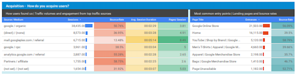
For example, in the dashboard above, the use of stoplight colors in the table on the left may leave stakeholders with the immediate impression that bounce rate (red) was bad while pages per session (green) is good. In reality, the person who designed this dashboard just wanted to break up the columns in the table with color and made an unfortunate choice. Meanwhile, the table on the right uses red bars to highlight poor performance, but there’s not enough context to understand why.
Building an effective dashboard is a moving target, because how people think about their business changes over time. However ,with a little bit of pre-work and attention to detail, you’ll be able to build the best version of the dashboard with what you have to work with.