It’s that time of year again. The leaves are turning, it’s starting to get cold outside, and the holidays are right around the corner.
For those of you running an e-commerce website, it’s one of your favorite times of year. With Christmas upcoming, consumer spending is about to skyrocket. Last year, Cyber Monday hit $2.29 billion in online sales. And 2013’s Cyber Monday grew 20.6 percent over the previous year. So yes, 2014’s Cyber Monday should be fairly successful.
Despite the increase in spending each year during Cyber Monday, there is always an opportunity to improve if you have an e-commerce site. I think I know the answer, but would you like to make more money this holiday season by increasing your e-commerce conversion rate? No duh!
Without further ado, here are 5 ways to increase your e-commerce conversion rate this holiday season:
5 Ways to Increase Your E-Commerce Conversion Rate
1. Simplify (or Shorten) Your Checkout Process
Many times, I’ll visit a website and I’m semi-interested in a product. I might purchase it, I might not. So I’m already on the fence once I put the product in my shopping cart.
But then I go to checkout, and see four or five steps. Ehh, I didn’t really want this product. *Exits to reddit*
What happened here? I was on the fence about a product, but the lengthy checkout process ensured that I had too much time to think about the product I wasn’t sold on to begin with.
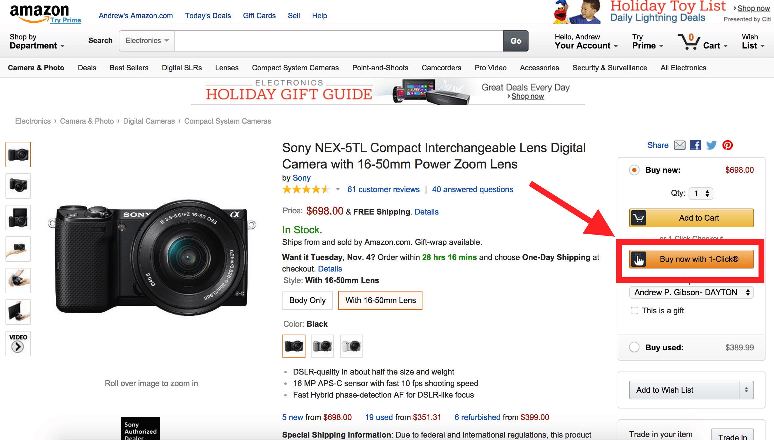
Let me give you a great example of a website that removes this lengthy checkout process. It’s called Amazon. You might’ve heard of it.
Their “1-Click” checkout allows logged-in customers (that have opted in) to click a single button (ONE. SINGLE. BUTTON.) to purchase a product. That’s easy right?
But what exactly is the right number of steps for your e-commerce website? There is unfortunately no single right answer. It depends on your website, the products you sell, and the users that come to your site.
Also, the length of the checkout process is less important than the simplicity. You can have a one step checkout process that requires so much information that the process hasn’t actually been simplified.
The easiest way to figure out what works best for your site is to test. To do this, you can use a tool like Optimizely. They can help you get set up and testing your checkout funnel pretty quickly.
2. Optimize your site for mobile
This seems like a fairly common sense strategy, but you would be surprised by how many e-commerce sites still aren’t optimized for mobile devices. With the rise in smartphone and tablet usage across the world, websites that aren’t optimized for these devices will suffer from lower conversion rates than sites that are optimized.
In fact, one third of all ecommerce purchases were made on a smartphone during the 2013 holiday shopping season, according to Custora.
And not only that, but two out of three customers prefer accessing a mobile website than a mobile application (Source: KISSmetrics). I know I’m part of the two-thirds that do not like to download a mobile app. Why should I have to leave my mobile browser to purchase a product? I want to purchase it now!
3. Speed up your website
A slow website can kill e-commerce conversion rate. In fact, a one second delay in page response can can result in a 7% reduction in conversions, according to KISSmetrics. Taking that a step further, a one second delay on an e-commerce site that makes $100,000 a day could potentially cost you $2.5 millon a year in sales. Sound like something worth looking into?
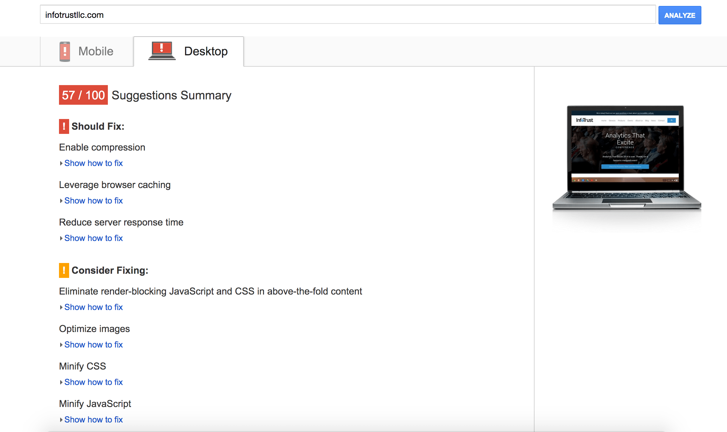
Luckily, there are many different ways to increase the speed of your website. I recommend running your website through Google PageSpeed Insights. It will scan your site and offer recommendations for speeding up your website. Pass the recommendations over to your development team. Your bottom line will thank you.
[Curious about the best web hosting options? Check out this article by Lars Lofgren of Quick Sprout.]
4. Create a sense of urgency
Anybody that’s seen an infomercial knows the strategy. “Call in the next 10 minutes and receive free shipping!” “Call now – only 100 widget’s left!”
What does this make you do as a consumer if you were any bit interested in the product? It makes you say to yourself, “I don’t want to miss out. I better hurry up and act now.” It’s called the Fear of Missing Out (FOMO) and it’s a real psychological conditional. Seriously.
This strategy is powerful, so utilize it. Here are a few ways:
- Show when products are low in stock
- Show when a sale will be over for a product
- Show when free shipping will be over for a product
A great example of this comes from travel websites. They do a great job incorporating inventory and time restraints. Let’s take a look at Expedia:
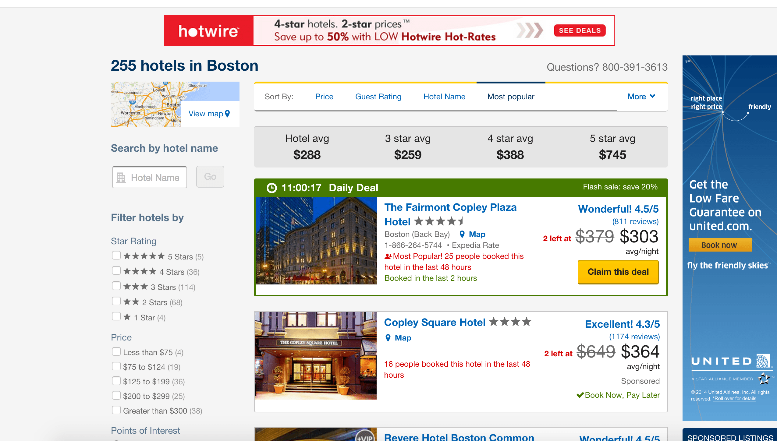
- They show the number of rooms left at the great price
- They show how many people booked the hotel in the last 48 hours
- And for the daily deal, they show how much longer the Daily Deal is available
You can utilize these same tactics to increase your e-commerce concersion rate.
5. Allow for users to purchase a product without registering for your site
How many times have you been on a site ready to buy something, you begin the checkout process, and it asks you to first create an account with the site? If you’re like me, it feels like every other time I buy something online. What the hell is that about?
Well, frankly, it’s dumb. I say this because research actually shows that 26% of users abandon a checkout funnel due to having to register before checking out.
You can see on FinishLine.com that I can choose to checkout as a guest. Yes, now we’re talking.
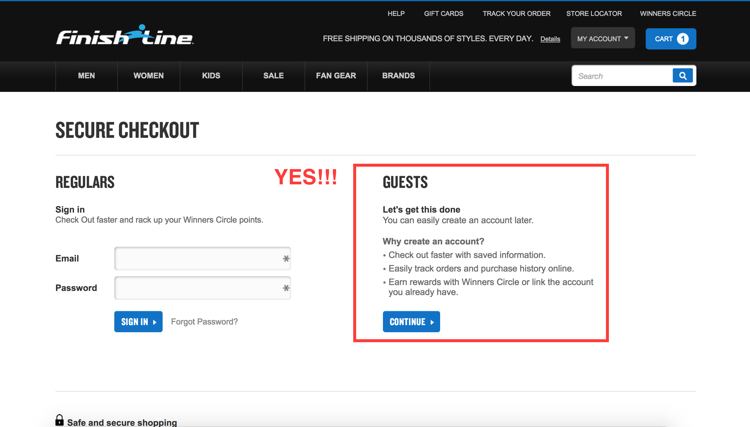
Moral to the story here: Don’t do this, it’s not only dumb, but it will cause people to abandon their shopping cart. You don’t want that.
Hopefully you’ve found this post enlightening (or at least a tad bit actionable). Now get out there and make some improvements! Good luck this holiday season.
Interested in learning more ways to increase your e-commerce conversion rate? Download the slides from our webinar on “Enhancing the Consumer Shopping Experience with Google Analytics”:

