
I acknowledge that I’m walking a fine line here. On the one hand, I’m seeing so many businesses do what appears to be capitalizing on the working-from-home trend—especially in light of the Coronavirus (COVID-19) fears. That’s not what I want to be associated with. To be clear, this article is not advice on why and how you should work from home.
On the other hand, the reality is that more and more employees are working from home, and this growing trend has some important implications in the digital marketing sector—implications I would very much feel remiss if I didn’t address.
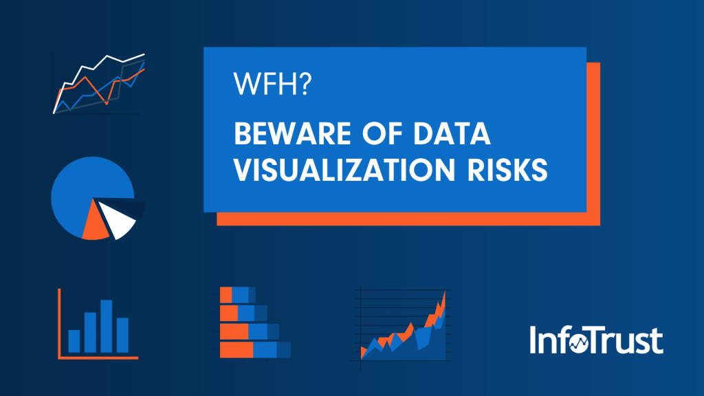
Biggest Drawbacks of Data Visualization When Working Remote
Once you arm yourself with the standard unified communications tools (such as Slack and Zoom), the next things most businesses rely on when working remote are dashboards. Dashboards were developed some time ago as a means to support large teams who all need to be looking at the same information. As Peter Drucker would say, “What gets measured, gets managed.” And yet there are some significant drawbacks to dashboards that are exacerbated when working remote, including:
- Not being clear on the purpose or the original design of the dashboard itself
- A lack of context, leading to different assumptions and conflicting interpretations
- Misinterpretation that’s magnified when the data itself is not well understood
- Lack of break-room chatter and impromptu conversations for understanding
- Multitasking and lack of focus, which further intensify these issues
Each of these issues has a significant impact on the effective use of data visualization and tends to show up as more team members work remotely. Once these issues are well understood, I’ll identify the important steps to take in order to minimize and overcome these issues.
Understanding the Purpose of the Dashboard
There are some fundamental truths that are important to understand before taking action on the data presented in the dashboard. Think of the dashboard as a snapshot. When it was first created, someone wanted the ability to cut through immense amounts of data in order to get a handle on a specific aspect of the business. Every dashboard is built on a set of priorities and assumptions about what is important. Most dashboards are built by a member of the IT team who worked to solve a very specific request. Sometimes the priorities may even be the default measurements provided by the dashboard software itself. Beware of official-looking views into data that fails to align with the business priorities.
For example, the sales team may have come up with a sales dashboard to track the pipeline of sales leads. While the data doesn’t lie, this is a very specific set of key performance indicators (KPIs) that purposefully ignore all the available data in order to streamline the most pertinent information for sales teams. Let’s say your marketing department begins using this dashboard for other purposes, not realizing the full extent of what data this dashboard is relying on, where the data comes from, and what other data sources are available (but are deliberately being disregarded for the ease of use of this dashboard). See how this can quickly become a problem? The sales snapshot, while helpful to sales leaders, can be misinterpreted and the wrong conclusions are acted upon by other teams.
The Risk of Lacking Context
Data doesn’t lie, but the wrong interpretations of data lead to inaccurate conclusions. Humans, by nature, are interpretation machines. A misunderstanding or wrong belief can lead to paying attention to metrics because they appear on the dashboard—even when the KPIs are different.
The most common example of this mistake is correlation versus causation. Just because two data sets are correlated doesn’t mean that one thing caused the other to happen. And yet, if we don’t have the full picture (or context) of what we are looking at, it’s easy to draw conclusions that are wrong. When working remote, this challenge is increased as individual knowledge workers build upon the assumptions of others—especially when they are presented as “facts derived from data.”
The “I Know” Trap When Working Remote
No knowledge can be accumulated when operating from the paradigm of “I already know this.” If one of your team members has already decided that they “know” something, then they begin to tune out the information being shared. This leads to multitasking where the person who thinks they already know what’s being discussed focuses on their other deadlines and priorities. This is especially true when someone is working remote and can easily appear to be doing one thing when really focused on something else. Without having the impromptu discussions face-to-face with colleagues, inaccurate beliefs can go unchallenged for quite some time until it surfaces as a significant problem for the company.
Overcoming These Data Visualization Risks
First, be sure your team knows who the dashboard was designed for and why it was designed in the first place. Then be sure the dashboard is displaying clean and accurate data. If the data is collected in the wrong way, pulled from an inaccurate source, or is simply not available, conclusions drawn from that dashboard will be wrong—possibly even damaging.
Be curious and encourage your team to explore multiple possibilities. This begins by clarifying the insights derived from the dashboard and verifying that these insights come from the most important (and accurate) data sources. When you sense that someone on your team is coming from a place of “I know,” and may even be annoyed with your question(s), don’t shy away. By remaining curious, you can quickly get to the root of the issue and determine if the conclusion that was drawn should be acted upon, or if more verification is needed.
In the months ahead, more economic pressure is likely to lead to a desire for fast action. All the more reason to understand and overcome the risks of dashboard and data visualization tools.