

Tableau, a data analysis and visualization tool, was founded in 2003 and acquired by Salesforce Inc. in 2019. It gained a lot of popularity and attention in the data community since its release date due to the user-friendly nature of the tool. Tableau’s drag and drop module, which can be both dimension-based and measure-based, ensures the tool is accessible and intuitive for users.
With many new features, additions, and enhancements over the last 18 years, Tableau is one of the market-leading business intelligence and analysis platforms available today. While most companies recognize the power of data and insights, organizations often use Tableau for the intersection of storytelling and data. This allows companies to better interpret its data and apply it towards their target audience. Tableau certainly paves the way for easier data management and faster discovery of insights.
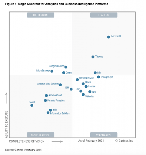
As per Gartner’s Magic Quadrant 2021, Tableau is one of the market leaders across all the BI products.
Available Products From Tableau
- Tableau Desktop – Gives an ability to create dashboards and visualization locally. The Tableau personal feature/version has limited data connectors and can be connected to the Tableau server, whereas the professional version has full enterprise capabilities. There is a free 14-day trial available for customers to assess the tool before making any investment.
- Tableau Public – It’s free! While it does not require any license, it comes with its own limitations. All workspaces and dashboards created in the Tableau Public version are made available to all the Tableau users. It is good for beginners looking to test out the tool before moving on to the desktop version.
- Tableau Online – A cloud-based analytics solution that empowers the user with the ability to access their dashboards and workspaces from anywhere. The user has the option to publish their dashboards and share it with other users as well.
- Tableau Server – Most suitable for mid-size or large organizations that already have a data lake, marketing data repository, (MDR), or data bundles. Tableau Server empowers data-driven decision making across the enterprise by providing siloed data stitching capabilities.
There have been many other products released by Tableau over the years (such as Tableau Prep and CRM) which are equally important, but looking into the above four will give you a solid foundation into the Tableau landscape.
For the purposes of this article, we will take a closer look at Tableau Desktop.
Tableau Desktop – The Home Page
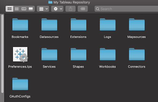
Once you download and install the free or licensed version of your system, Tableau will automatically create a repository for your workbook (a workbook consists of visualizations and dashboards that we create in Tableau) and other file management. Make sure to verify the location of this folder so that you can reference it when need be (for example, for organizing data sources or connectors).
When you login to Tableau Desktop for the first time, the home screen looks something like this:
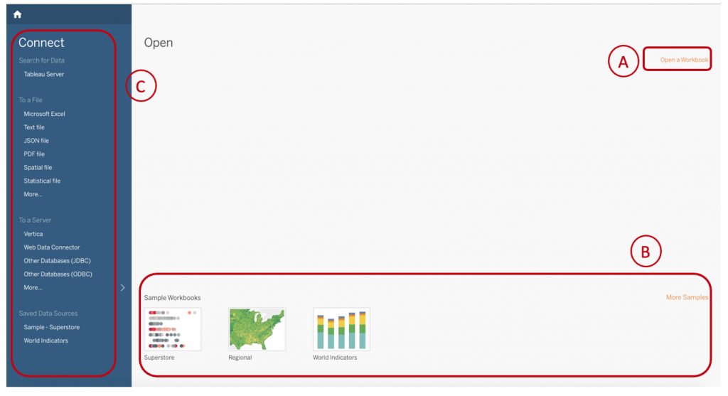
- Open A Workbook [Section (A) in the screenshot] – If you already have a few downloaded workbooks or workbooks that are shared with you, you will have an option to directly open them in Tableau. Click on “open a workbook” and it will take you to the workbook folder in your Tableau repository.
- Samples [Section (B) in the screenshot] – If you are new to Tableau and want to get some inspiration on the different types of visualizations you can create, feel free to browse the samples. Clicking on “More samples” will take you to the Tableau solutions gallery, which has many sample workbooks available for exploration.
- Connect Pane [Section (C) in the screenshot] – Tableau supports multiple forms of connectors from static files to many well-known databases and servers, as well as its own dedicated server (aka Tableau Server). You will also have an option to connect with multiple data sources at a time and perform data blending in Tableau to enrich your data for better insights.
If you are looking to connect the static files, you’ll have the option to connect Microsoft Excel, text files, JSON files, statistical files, etc. If you are looking to connect to the database, you’ll have many options:
- Google Analytics (GA) – You can connect your GA data to Tableau using the same GA account login details. It’s important to note here that you can only connect to GA accounts and properties that you have access to. You also need to select the date range, filters, and segment to create an extract that Tableau will import.
NOTE: Currently, GA data can only be imported to Tableau as extracts (static data) only. - Google Ads – Tableau allows their users to connect to Google Ads data using the same Google Ads account login details. You will also need your account and client customer ID to be able to make this connection and start with data import.
- Google Big Query – Tableau will give you an option to connect with a default data source or billing project when you connect to BigQuery. From the billing project, you will have the option to connect to the list of projects, datasets, and tables.
There are many more server connectors available in Tableau as shown below:

Data Source Connection and Blending
Once the data source is connected to Tableau, the data source workspace will open. This gives the user all information about the connected data source in a tabular display of data (if the data connection is successful). There are many more functionalities available in the data source section which we will discuss below:
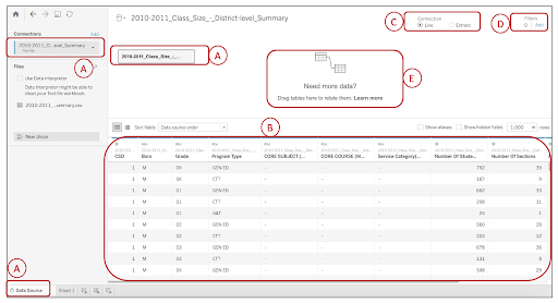
1. Data Source/Connection [Section (A) in the screenshot] – These highlighted sections in the workspace indicate a live data source connected to tableau. One has multiple options to either disconnect the live database, define if the first line of the connected datasheet is the header, or automatically define the header.
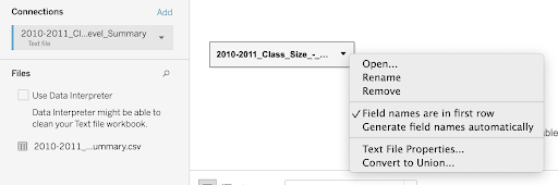
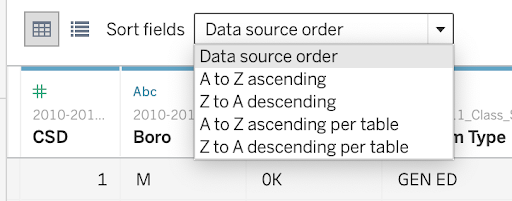
2. Data Table Pane [Section (B) in the screenshot] – Once the data connection is successful, you will be able to see your data in a tabular format in the table pane. This section picks the first row of the data sheet as the header (unless you change the setting as shown in the above section). You can also sort the data in the header details from the “Sort field” drop down.
You also have the option to rename a field, hide or split values, and create calculated fields and groups.

3. Connection Type [Section (C) in the screenshot] – There are two types of connection options available in Tableau to connect with your data set. Either you can connect “Live,” which means you will have a real-time connection with your data; or you can connect with the data “Extract,” which is a compressed snapshot of data stored locally and loaded into memory as required to render a Tableau visualization.
Both connection types have their own pros and cons, but for larger queries that are expected to return high volume data, it’s recommended to use an extract to improve the performance and speed of rendering of a visualization.
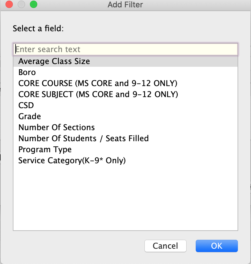
4. Filters [Section (D) in the screenshot] – Tableau also gives you an option to create filters for data right at the connect time (you can also do the same while creating our own worksheets or visuals). Filtering out some of the irrelevant fields right at the connection can reduce the query processing time and hence improve the performance.
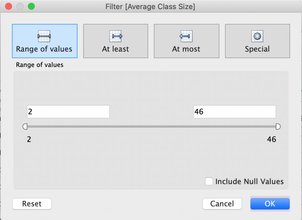
You can also create filters on a range of values (examples include smaller than, greater than, or special cases as shown in the screenshot below).
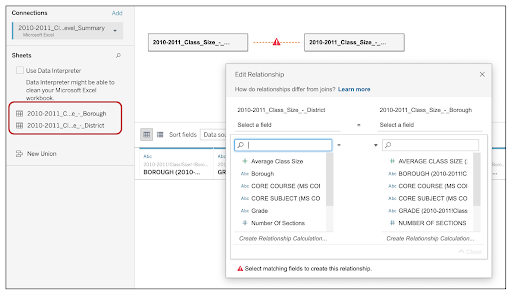
5. Data Blending [Section (E) in the screenshot] – Once you have connected multiple data sources or multiple data sheets from one source (consider data multiple tabs of an excel sheet), Tableau will give you an option to blend the data. Tableau has a very powerful and user-friendly data blending workspace where you can drag and drop all data sheets and join them together. Most of the relational database concepts apply here when it comes to joining the data sets. You must have a unique identifier in common in both the datasets to be able to join them. Tableau will then prompt you with a pop-up to define that relationship.
Your First Visualization
After you have set up the connection successfully with all intended data sources, you are ready to create your first data visualization! Not so difficult anymore … right?
This is how the Tableau blank worksheet with data connection looks like. The data fields in the connected table (data sheet) will be imported in the left pane of the worksheet and will appear as Dimensions and Measure.
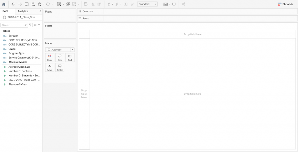
- Dimensions (Abc value in blue) – These are qualitative values and mostly determine the characteristics of an object such as names, dates, or geographical data, etc. They are used to segment, filter, or categorize data. Dimensions are also used to break down your data analysis and visuals by adding multiple secondary levels of data aggregation. These fields will form the headers of your visualization.
- Measure (# value in green) – This is the numeric and quantitative value that defines the measure of the dimensions.
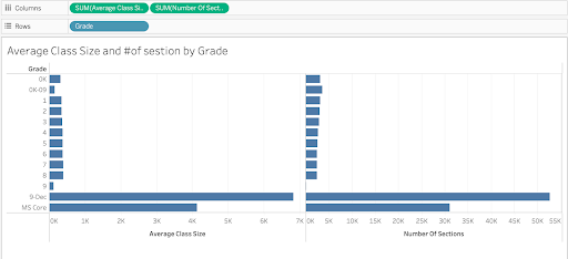
Now, let’s say when looking at the above screenshot you want to visualize the average class size and number of sections by grade. Drag and drop the measures as columns and Tableau will aggregate the number accordingly. Next, drag and drop the dimension (Grade) in the row.
By default, Tableau will visualize the data as bar charts and here you go! You have your first visualization.
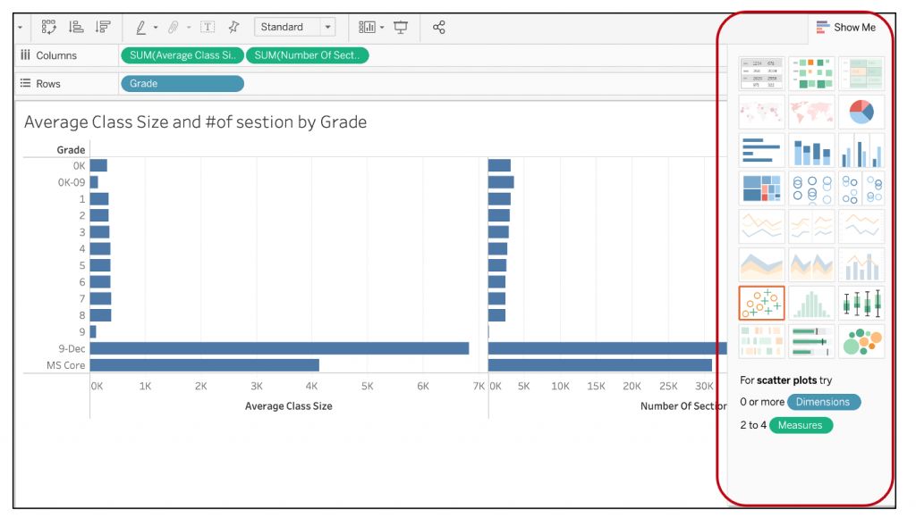
You have options to change the visual format and the graph type. Click on “Show me” on the top-right corner of the Tableau screen and it will give multiple visual options like tabular format, pie chart, bar graph, aggregated bar graphs, heat maps, scatter plots, etc.
To change the visualization type, click on the first option “text table” and you will notice that the workspace display changes to the tables with text data (as shown in the below screenshot). You will also notice that Tableau moves all metrics under the “Measure values” section in the left panel.
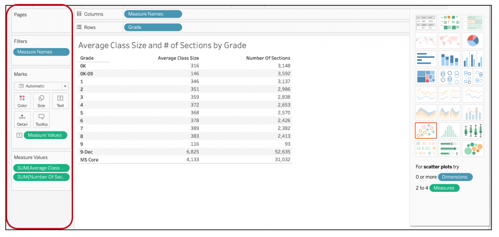
Tableau also gives you an option to add “Marks” and “Filters” to the data displayed.
- Marks – Tableau has a provision to add more depth of details to your visuals by adding color, size, text, detail, or tooltip. You can also add more than one marker on the same data field. Each of these marks has a specific use and mostly depends on your hypothesis and visualization. For example, if you are comparing sales for a region and profits for a country, it will make sense to add a size marker for sales to show the impact, and a color marker for profits to show the differentiation.
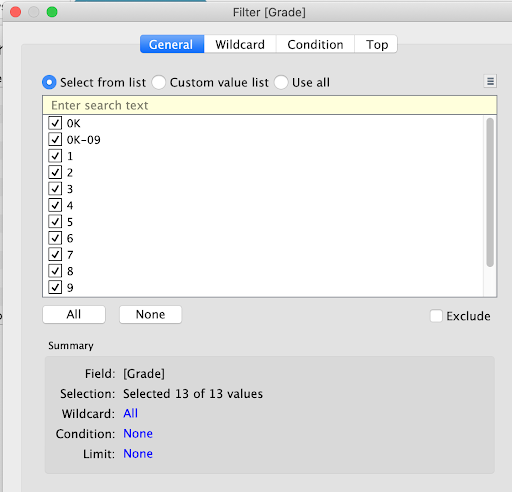
- Filters – Filters are used to present a subset of data that you would like to focus on in your visualization. Tableau has a different way to define filters for data selection for the visual. The most common format is the form list selection where users can select the values of the dimension that they want considered for the visual.
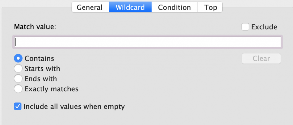
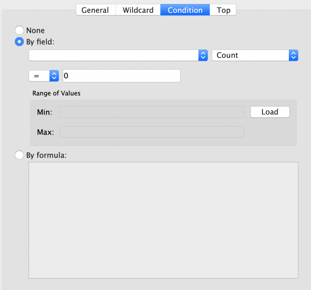
You also have an option to define a wildcard “match” option like contains, starts with, etc. If the user has a requirement for a specific set of data from the population set, they can define a condition by a field or define an overall formula (logic) to access that specific data set.
Conclusion
Data literacy is going to be much more prominent in the post-pandemic world, and powerful storytelling using data is going to be one of the major tasks of the data maverick. With so many data visualization tools floating in the market, it is always a challenge to pick the right one that both fits into your organization’s tech stack and provides seamless integration. Considering these factors, Tableau has emerged as one of the industry-leading tools, empowering its users to make data-driven decisions. Keep an eye on this space as we have more to come on building advanced visualizations and Tableau dashboards.