If you’ve used Google Data Studio, you’ll know how easy it is to create visual reports and dashboards. However, the product is still in beta and that means not all of the features you would like are there just yet. Sometimes, a little creative thinking and a few shortcuts are required to make the product work for you. Here are some tips you may not have known about:
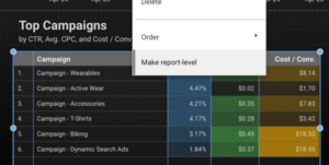
Page Level and Report Level
You can make any Data Studio object page level or report level.
Data Studio likes to refer to objects as “components.” By default, all components are page level, meaning they will only appear on the page you have placed them. Report level objects appear on all pages, existing and new, and carry over the data source and style settings originally selected. This includes shapes, images, and text boxes.This means you only have to create your report title/banner, background, and design once.
The same applies to date range selectors and filter controls. This will keep all charts synced on the date range and/or filters chosen on any page throughout the report (unless you choose otherwise).
Group Objects
You can select multiple components on a page and group them together.
- Click + drag, cmd + click, or ctrl + click to select components, depending on your device and preference
- Right-click > Group to group components
Once grouped, components will move together. You can change the alignment of the group and you can also copy and paste a group of components (even from one page to another). In addition, you can change the depth of the components (bring forward, send back, etc.).

Filter Control
Use the filter control component to filter on a particular dimension. When you first place a filter control component on the page, it will apply the filter to all other applicable components (charts) on the page. You can also apply the filter to only specific charts by selecting the charts AND the filter and grouping them together.
I also recommend hiding the reference metric (Filter Control Properties > uncheck “Show Values” under metric) when using a filter control to give a cleaner look and reduce confusion (unless you want to show the metric aggregation in your report)

vs.

Now you can use these easy tips and tricks to make your reports and dashboards created in Google Data Studio that much more visually appealing!
This is the first in a series of posts about tips for using Google Data Studio. Read our additional posts to learn more tips!
- Google Data Studio Quick Tips: Creating a Funnel Report
- Google Data Studio Quick Tips: Creating a Calculated Field
Want to learn more tricks and tips to make your Google Analytics Reports stand out? Contact your InfoTrust Consultant today!