

Having a strong analytics platform is critical to enhance and maintain an online presence for your business. However, it’s not just about having a robust analytics platform. It’s also important to know what you are actually doing with the clean data you have and how you are using it to make better decisions in your organization. Dashboards can be a powerful tool to help you get a clear picture of your data and help you make better business decisions.
Why Are Dashboards Critical?
Dashboards allow you to visualize the most crucial information needed to meet your goals and objectives. They are best used as a quick snapshot of your most important KPIs where you can compare different attributes or metrics against the previous quarter all on one screen.
Stephen Few, author of Information Dashboard Design, defines dashboards as a “visual display of the most important information needed to achieve one or more objectives, consolidated and arranged on a single screen so that the information can be monitored at a glance.”
So what makes a good dashboard? According to Stephen Few, a dashboard needs to have the following components:
- The views need to have a specific objective or a set of objectives. A dashboard has to tell a story.
- The data needs to be well organized and have meaningful insights.
- Data needs to be geared towards the intended audience. Before creating the dashboard, you need to ask yourself, who will be looking at this dashboard and how frequently?
While it’s a useful tool to assess performance of your business, lots of teams miss the mark when building an effective dashboard.
[Watch now: Building Best in Class Dashboards in Data Studio]
What Makes an Effective Dashboard?
In order to build an effective dashboard, it’s important that these questions are answered before you even begin building out the dashboard:.
- State the dashboard purpose: Your dashboard needs to have a specific goal.
- Make sure your goals are clear: When creating the dashboard, make sure you have an intended outcome.
- Know your audience: Make sure your dashboard is geared towards your intended stakeholders.
- Document business questions: You should be assessing how frequently the information should be updated, who will use the dashboard, what are the main KPIs, and what should the dashboard answer?
- Identify the most important information needed: What are your most important business questions needing answers?
It’s important to answer these questions before you build your dashboards. This is the most important, yet often skipped portion when building dashboards.
Why Do Teams Miss the Mark on Dashboards?
These are the most common mistakes teams make when creating dashboards:
1. Supplying Inadequate Context for the Data
Teams often get wrapped up in placing all KPIs or other charts/graphs front and center of the dashboard, yet they fail to bring forth any context to the data. In order to get a gauge on performance, you need to have something to compare your KPIs (ie. previous quarter or a specific end goal)
2. Displaying Excessive Detail or Failing to Identify Information Effectively
Dashboards should only be displaying the high-level information/KPIs you’re most interested in.
3. Choosing Inappropriate Display Media
Having the same type of charts on the page can be mundane to the eye. It’s important to have varied visual representation.
4. Introducing Meaningless Variety
Similar to choosing inappropriate display media, it’s important to keep your dashboard consistent and not full of random charts.
5. Arranging Information Poorly
The most important information should be prominent. Sometimes, there is so much information being presented in the dashboard that users miss what’s most important to their business goals.
6. Cluttering the Display with Visual Effects
Oftentimes when creating a dashboard, it’s easy to get caught up in making the dashboard pretty with fancy visual effects. While creating a visually appealing dashboard is important, focusing too much on the design elements can distract users to where they miss out on important information.
7. Misusing or Overusing Color/Designing Unattractive Visual Displays
This is one of the most common mistakes people make when creating dashboards. Examples can be using wild or unappealing colors. People can also often create dashboards that are just plain unattractive.
How to Set Up Pre-building Documents and Wireframes
Pre-building documents enables you to create a thorough line from build to final dashboard that can easily be referenced later. Going through this process helps ensure reporting success since nothing will be a surprise to stakeholders. You can also use these documents if stakeholders ever wonder why certain decisions were made in the final design. This is a mechanism to ensure that everyone is aligned before you build a dashboard. Who wouldn’t want that?
Pre-building Document
A pre-build document helps lay out the essential elements of your dashboard which are the following:
- Purpose of the dashboard
- Questions the dashboard is intended to answer (i.e were financial goals met, KPI performance, etc.)
- Main KPIs
- List of dimensions/metrics (attributes) used in the report
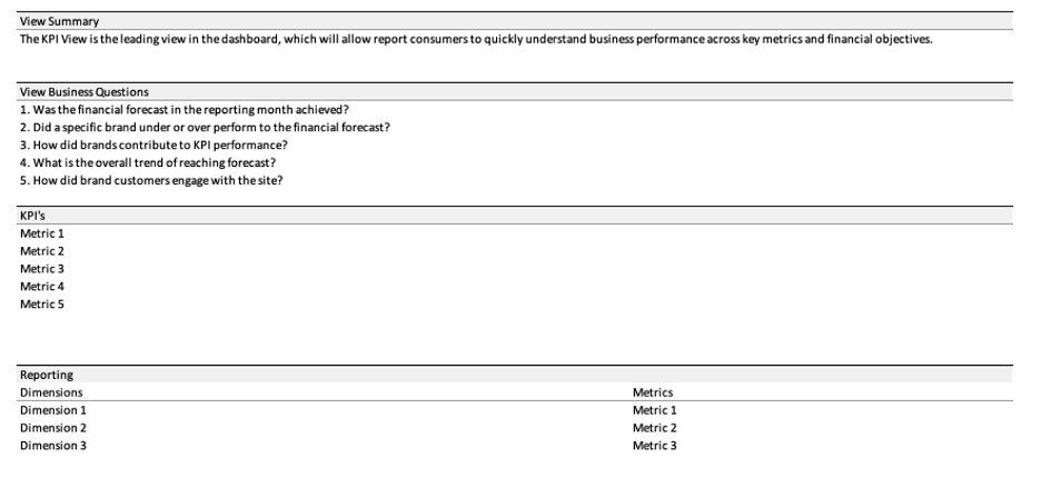
Here is an example of a pre-building document. It’s a useful tool to outline what to include in your dashboard.
Wireframes
A wireframe is a visual layout of your dashboards. This is where you start creating graphs and visual displays.
You can either create an Excel/Google Sheet or Google Data Studio wireframe that lays out all charts you’re utilizing. Here are the benefits of creating a wireframe:
- Prioritize most important data: They help prioritize what comes first and who to engage.
- Make sure your stakeholders are happy with the end result: It’s easy for stakeholders to not be happy with the end result, or for the dashboard to not really be useful at the end. By utilizing wireframes, stakeholders know what to expect and ensure that the dashboard will answer their most critical business questions.
- Transfer charts onto the final dashboard: By having a wireframe with all graphs, you can simply copy and paste your work onto the final dashboard. The grunt work will be over and the only thing you’ll need to do is make final design touches to the dashboard.
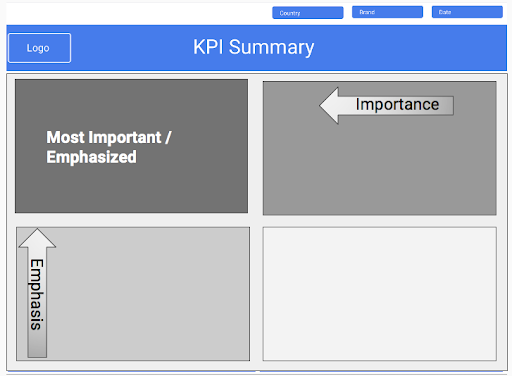
Here’s an example of a wireframe below created by our Advanced Analysis and Data Visualization Specialist, Dan Vivaldelli.

When creating a wireframe, it’s important to place the most important aspect of your report at the top-left corner. This is what you want to keep in mind when beginning to outline your dashboard.
Here’s an example below of how your data should be displayed on your dashboard:
Conclusion
Think of it this way: if you were writing an essay or blog, you would likely first start out with an outline of your most important points. You would then write up a final draft before submitting a completed essay. Both the pre-building document and wireframes act as the outline and final draft in this scenario. Your pre-building document lays out your most important business questions and desired outcomes, and your wireframe is a final draft of what your dashboard will look like. Afterwards, put all the pieces together in your actual dashboard and voila!